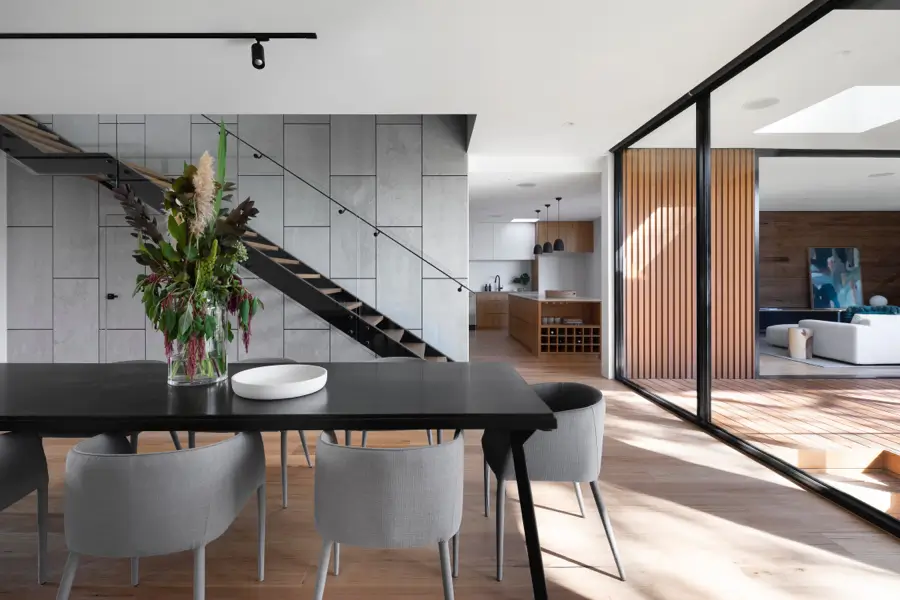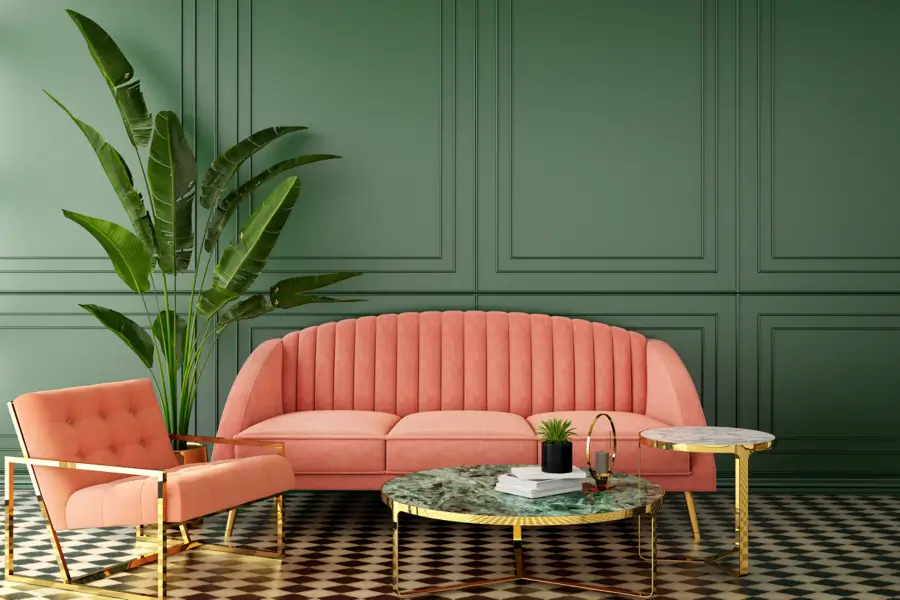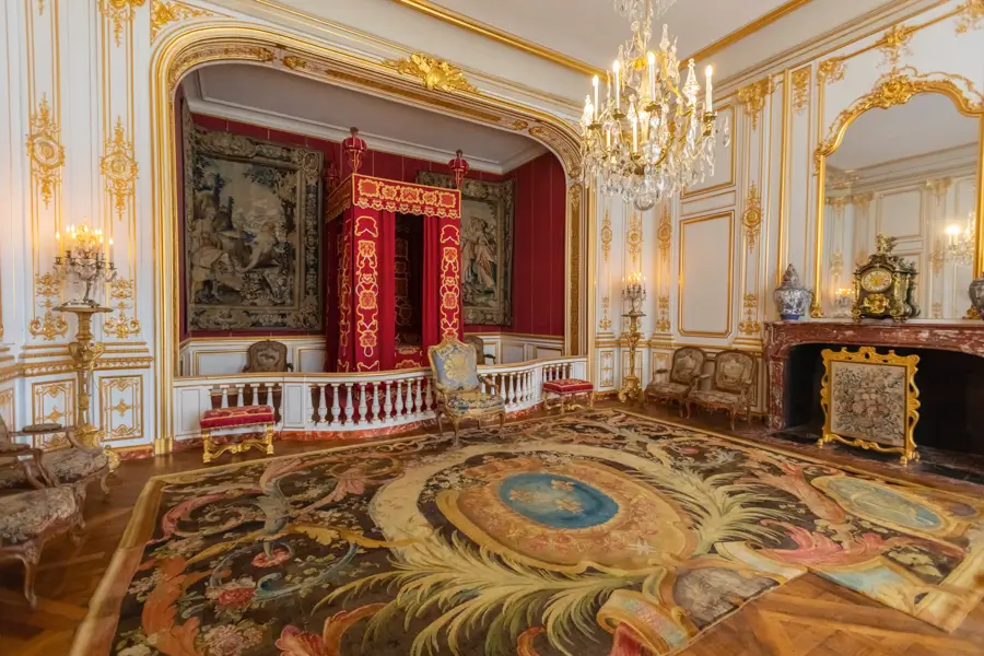
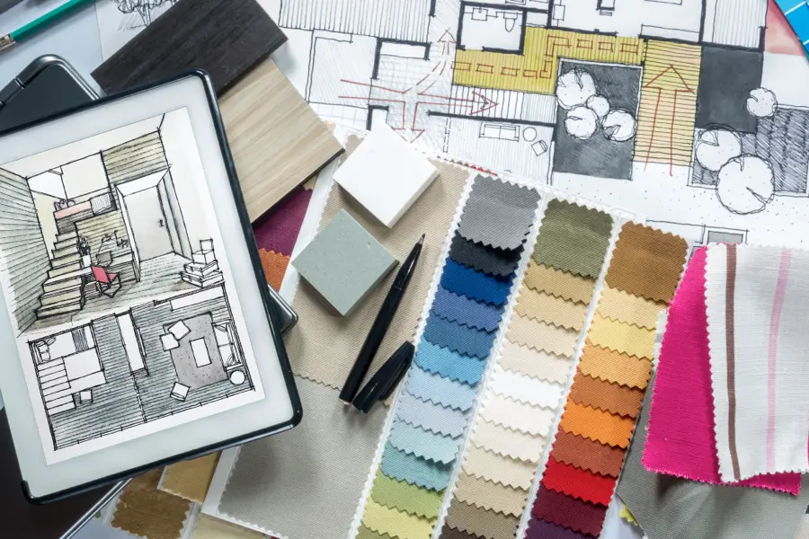
INSPIRATION
But, what is color? In physics, color is essentially the way our eyes and brain perceive different wavelengths of light reflected off objects. Take, for instance, the rainbow, which represents the spectrum of colors that the human eye can see – red, orange, yellow, green, blue, indigo, and violet. That’s color, so, what is black and white? Some people maintain that white is the absence of all colors and black is the presence of all colors. However, science explains that objects appear white if a rough surface reflects different wavelengths at about the same strength. Black color means that an object absorbs all wavelengths instead of reflecting them. So, what does that say about the colors we see?
The basis of all colors are the primary colors of red, yellow, and blue. By combining these colors, you can get every other color, but, you can’t create these colors by mixing other colors. The secondary colors are green, orange, and purple (or violet), which are made by combining red and blue, yellow and red, etc. The tertiary colors are the six grandchildren of the primary colors, so to speak. They have names like blue/green, red/orange, yellow/green, etc. Although this seems elementary and straightforward, it’s not, because, in design, different industries use different color wheels. They might also use different primary color basics, such as RBY (red, blue, yellow), RGBY (red, green, blue, yellow), and CMYK (cyan, magenta, yellow, and key (or black)). In addition, different color wheels can include only tertiary colors and/or a variety of hues.
In interior design, however, there are some basics you need to know when using a color wheel.
Complementary Colors – These are colors or hues that are directly opposite each other on the color wheel, like blue and orange or yellow and violet. Complementary colors are usually used as accent colors in small quantities.
Triads – Triads form a triangle on the color wheel, like yellow, blue, and red, or orange, green, and violet. These colors can also be used as accent colors, but they must be balanced. If not, they can overwhelm a room.
Analogous Colors – These are groups of colors that are right beside each other on the color wheel, like red, orange, and red/orange.
Monochromatic Colors – Keeping it simple, this is the use of only one color, but in shades from dark to light, like navy to powder blue.
Cool and Warm Colors – Cool and warm colors are typically used to create a mood in a room. Cool colors are blues, greens, and purples, while warm colors are reds, oranges, yellows, and pinks.
Non-Colors – Non-colors aren’t found on the color wheel but still play a very important role in interior design. Non-colors are the greys, beiges, browns, whites, and black.
We’ve discussed the basics of color, but what is color psychology, and why is it important to interior design? Wikipedia describes color psychology as ” the study of hues as a determinant of human behavior.” There’s little doubt that the colors that are chosen for a project can affect a person’s mood, state of mind, and overall disposition. The way color affects our mental and emotional constitution dates to the ancient Egyptians, who studied the effects of color on mood and used them to accomplish holistic benefits. For example, red was thought to increase circulation, orange to increase energy, and blue to soothe pain.
The development of modern psychology also expanded the study of color, which has been used in design and marketing, architectural design, and, yes, interior design successfully for decades. Even Swiss psychologist Carl Jung defined the four temperaments in terms of colors: sunshine yellow, earth green, cool blue, and fiery red.
Taking this one step further, how does color make us feel? Red emotes feelings of energy, war, danger, strength, power, and determination, but also passion, desire, and love. The various shades of red are light red, which represents joy, sexuality, passion, sensitivity, and love. Pink signifies romance, love, and friendship. Reddish-brown is associated with harvest and fall, and dark red is associated with vigor, willpower, rage, anger, leadership, courage, longing, malice, and wrath.
Interior designer Denna McLaughlin of City Studios says, “Red is never boring.” It is an excellent accent color; you can use it to make a ‘cool’ room warmer; red is great for kitchens, and it is known to increase appetite, and red accent walls can change the way a room is perceived. As the most intense color, red raises a room’s energy and is a good choice when a homeowner wants to stir up excitement, particularly at night. Red stimulates conversation and creates a strong first impression.
Pink, on the other hand, represents compassion, nurturing, and love, and depending on the hue, it can make a room playful, feminine, and warm. “Keep in mind, pink has the tendency to go sweet and sappy quickly,” says color expert Kate Smith. “So, if a homeowner doesn’t want a romantic, girly look, keep lines simple and clean and use sophisticated fabrics.” That said, pink is a wonderful wall color to create a feel-good atmosphere. It can be used for “girly” children’s or teenagers’ rooms or to add glamour or comfort to a dining room.
Orange is associated with joy, sunshine, and the tropics. It represents enthusiasm, fascination, happiness, creativity, determination, attraction, success, encouragement, and stimulation. It is the only color to take its name from an object the orange. It is a somewhat polarizing color, and people either love or hate it. In ancient cultures, orange was thought to increase energy levels and heal the lungs. But, dark orange can also mean deceit and distrust. Red-orange corresponds to desire, sexual passion, pleasure, domination, aggression, and thirst for action. Gold, a distant variation of orange, evokes the feeling of prestige; the meaning of gold is illumination, wisdom, and wealth. Leatrice Eiseman, color expert and executive director of the Pantone Color Institute, and author of the book “Colors for Your Every Mood” says, “Orange has steadily progressed up the ladder of consumer preferences, so there’s a greater appreciation for the color.” Like red, orange stimulates appetite and is a great kitchen and exercise room color. An apricot or terra cotta orange (increasingly popular in the mid-west) can be relaxing. Bright orange adds warmth and adventure but can be overpowering if used excessively.
Yellow is the color of sunshine and is associated with joy, happiness, intellect, and energy. It is an excellent choice for kitchens, dining rooms, and bathrooms. In hallways, yellow can feel welcoming. However, studies show that people are more likely to lose their temper in an all-yellow interior, so it should be used sparingly. Dull or dingy yellow represents caution, decay, sickness, and jealousy and is rarely used in interior rooms. Light yellow is associated with intellect, freshness, and joy, and is a great outdoor house paint. Bright yellow evokes optimistic feelings. Interior designer Jennifer Agus of Agus Interiors says, “Yellow is an uplifting color, but you really have to pick the right shade. You want to make sure it’s not too bright or too muted…” But, for a sophisticated look, use deep yellow and gray. Yellow and orange are excellent choices for breakfast spaces, and yellow is great as an accent color in small quantities.
Green is the color of nature. Considered the most restful color for the eye, green can transcend a sense of calmness and security when used in interior design. Green symbolizes growth, harmony, freshness, and fertility, and generally makes people feel emotionally safe. Green is well-suited for every room in the house and can have a calming effect when used as the main color for decorating. Pairing light green with grey can create a modern feel, and using different shades in one room can add contrast. But, the various shades of green can evoke completely different feelings. Dark green is associated with ambition, greed, and jealousy, while aqua is associated with emotional healing and protection. Yellow-green can indicate sickness, cowardice, discord, and jealousy, while olive green is the traditional color of peace. Interior designer Shannon Kaye says, “You can decorate an entire room with greens and have contrast, drama, richness, and balance. It’s so versatile.”
Blue, by far, is the most popular color in the US and is associated with trust, loyalty, wisdom, confidence, intelligence, faith, truth, and heaven. Blue slows down the metabolism and has a calming effect, so it is considered to be beneficial to the mind and body when used in the home or office. It is said that blue will help bring down blood pressure and slow the heart rate. Light or pastel blue can create tranquility and is associated with health, healing, understanding, and softness, but can come across as ‘chilly’ on the walls in a room that receives very little natural light. Dark blue represents knowledge, power, integrity, and seriousness. Deep midnight blue can create a feeling of luxury when used in a bedroom. Sapphire blues can be great as accent colors. Jackie Jordan, the Director of Color for Sherwin-Williams, says, “Those brighter French blues and sunflower yellows are a fun combination for a kitchen.”
Purple, in its darkest values, is dramatic, rich, and sophisticated. It can give a design scheme depth and is associated with luxury and creativity. Lighter values of purple, such as lavender, can add a restful quality to a bedroom. Plus, about 75 percent of pre-adolescent children choose purple over any other color. Interior designers use purple to add drama, create a hip feel by combining purple, pastels, and modern art, add a bold statement with neon purple, or give a room a mysterious feel with dark purple as an accent.
Recent Posts


Popular Posts


The Art Career Project is a trusted resource for emerging and professional artists.